KORK
BRAND IDENTITY
PACKAGING DESIGN
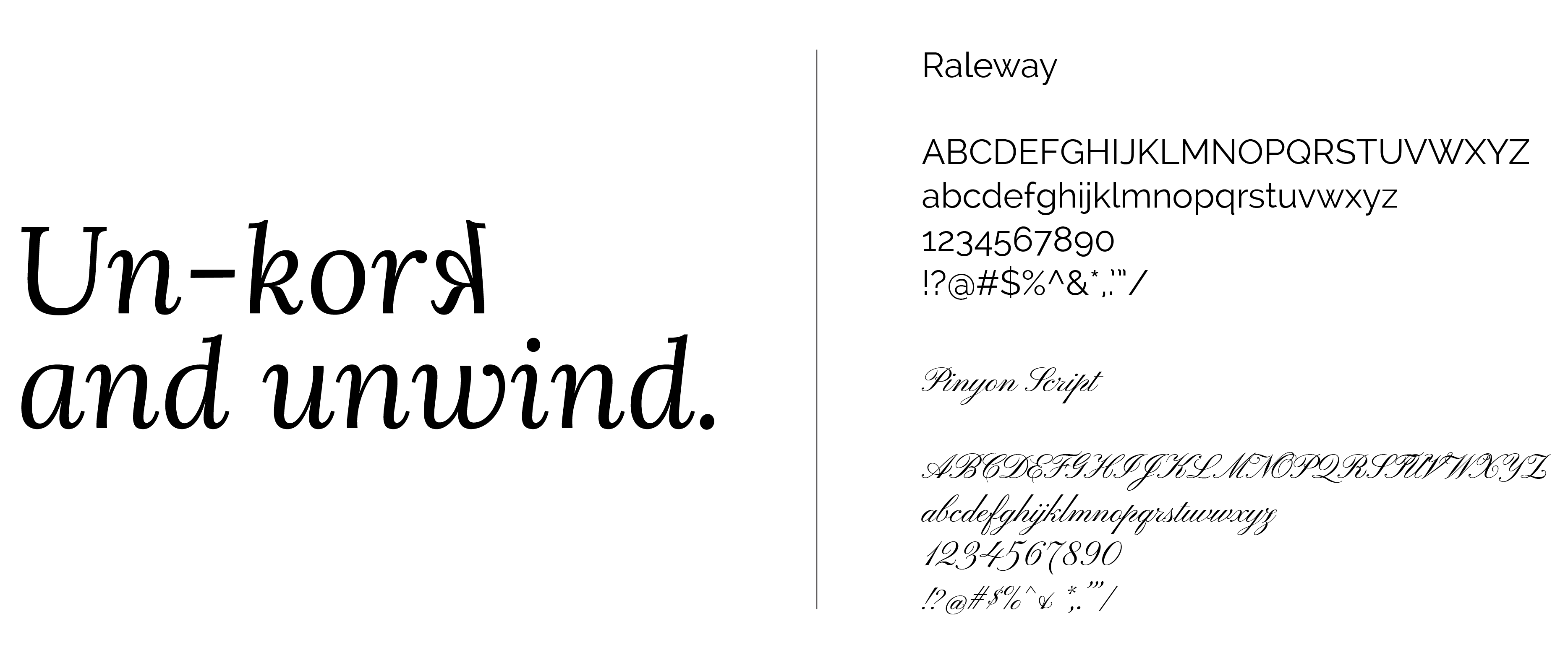
Adobe Illustrator
Adobe Photoshop
Kork is a fresh, modern wine brand designed with one core goal in mind: to make wine selection easy, intuitive, and visually engaging—especially for the everyday shopper. With today’s culture so deeply influenced by reviews and external opinions, choosing a wine can feel overwhelming, particularly for those new to the space. Kork eliminates this overthinking by delivering a brand identity that feels right at first glance.
The concept for Kork was sparked by the challenges within the wine retail category. We live in a time where we’re constantly told what to think before we’ve experienced something for ourselves. Wine is no exception. I wanted to create a brand that feels neutral, confident, and uncomplicated—an identity that empowers consumers to make their own choices and feel good about them. This is especially important for the younger demographic (ages 19–30), a group curious about exploring new blends but often unsure of where to start. This audience is also highly visual and social media-savvy, so the design had to reflect that balance of clarity and personality.
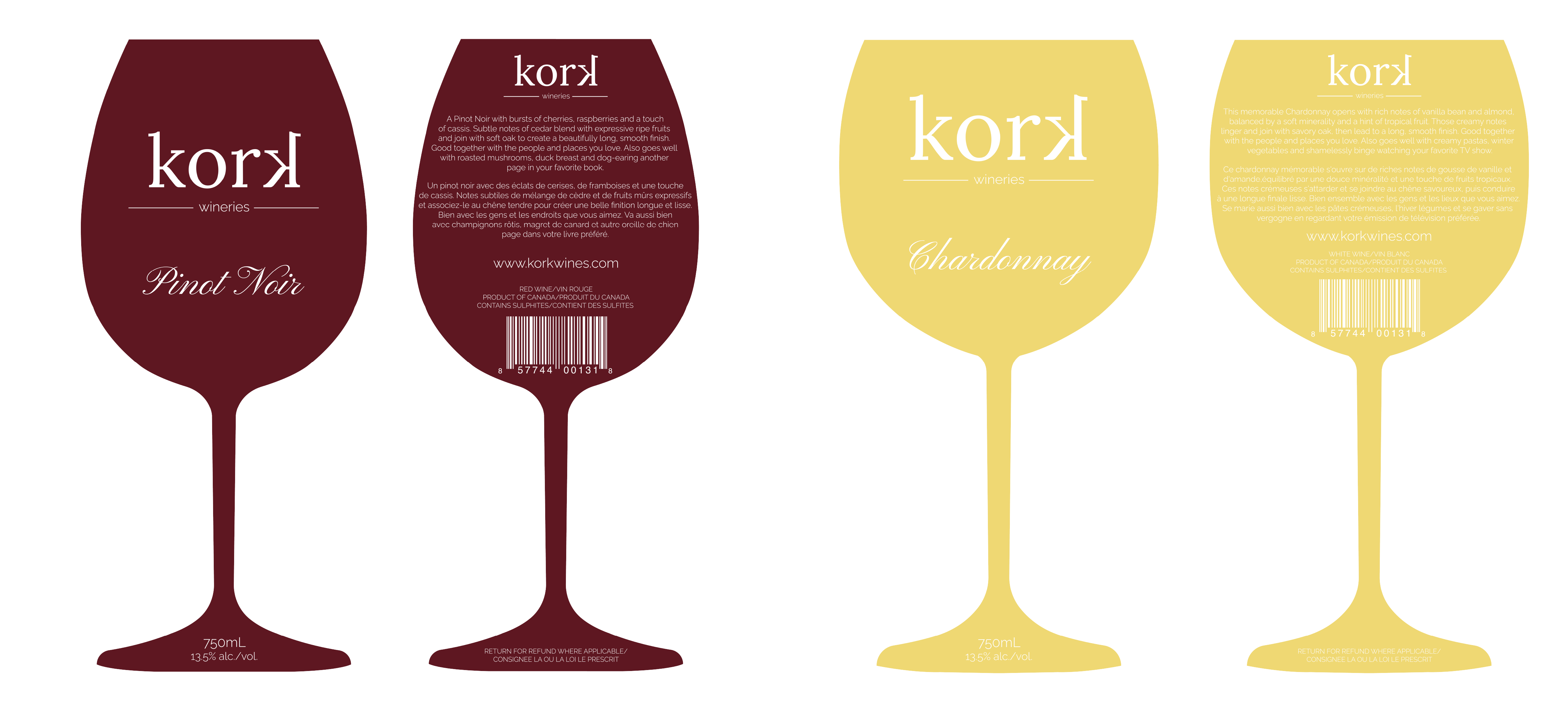
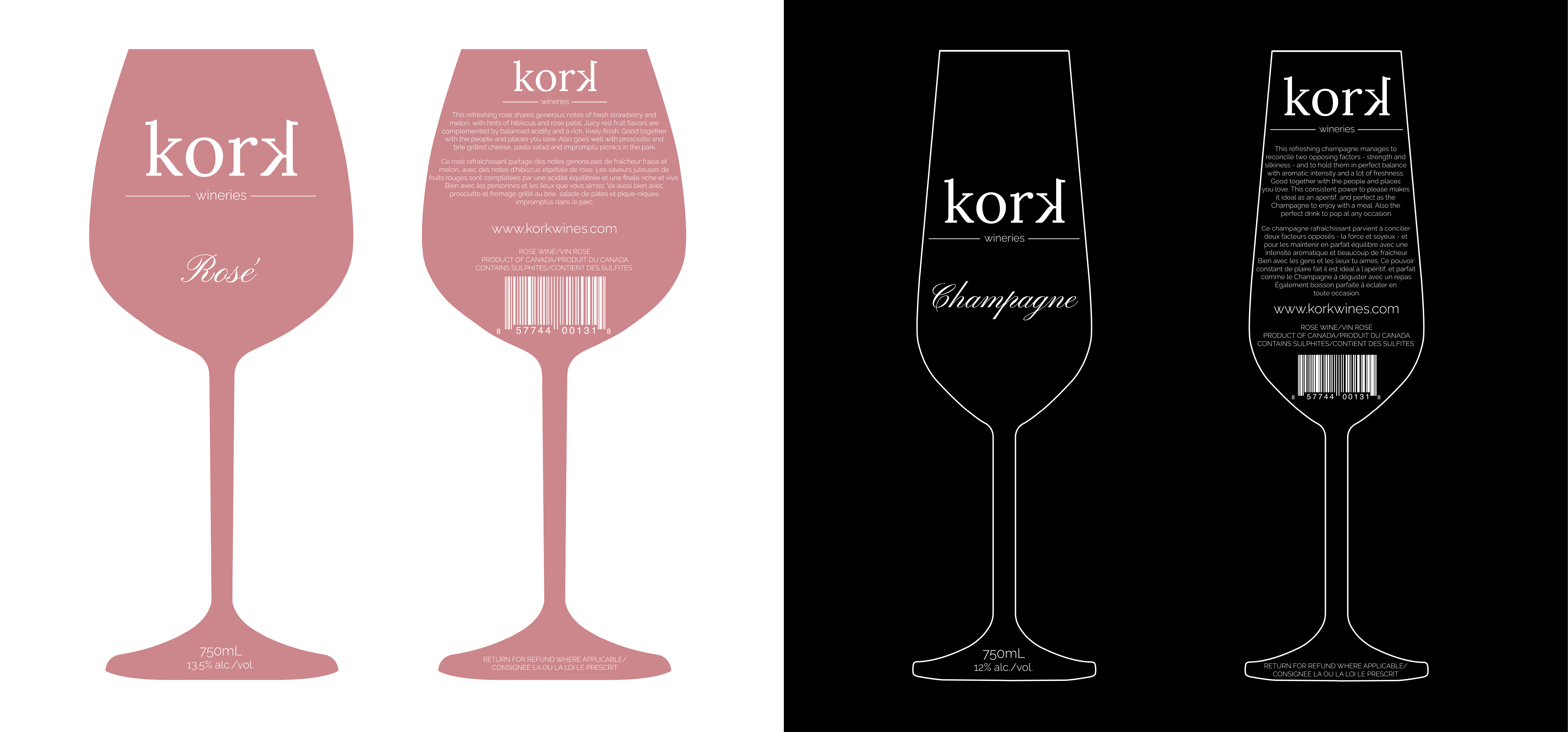
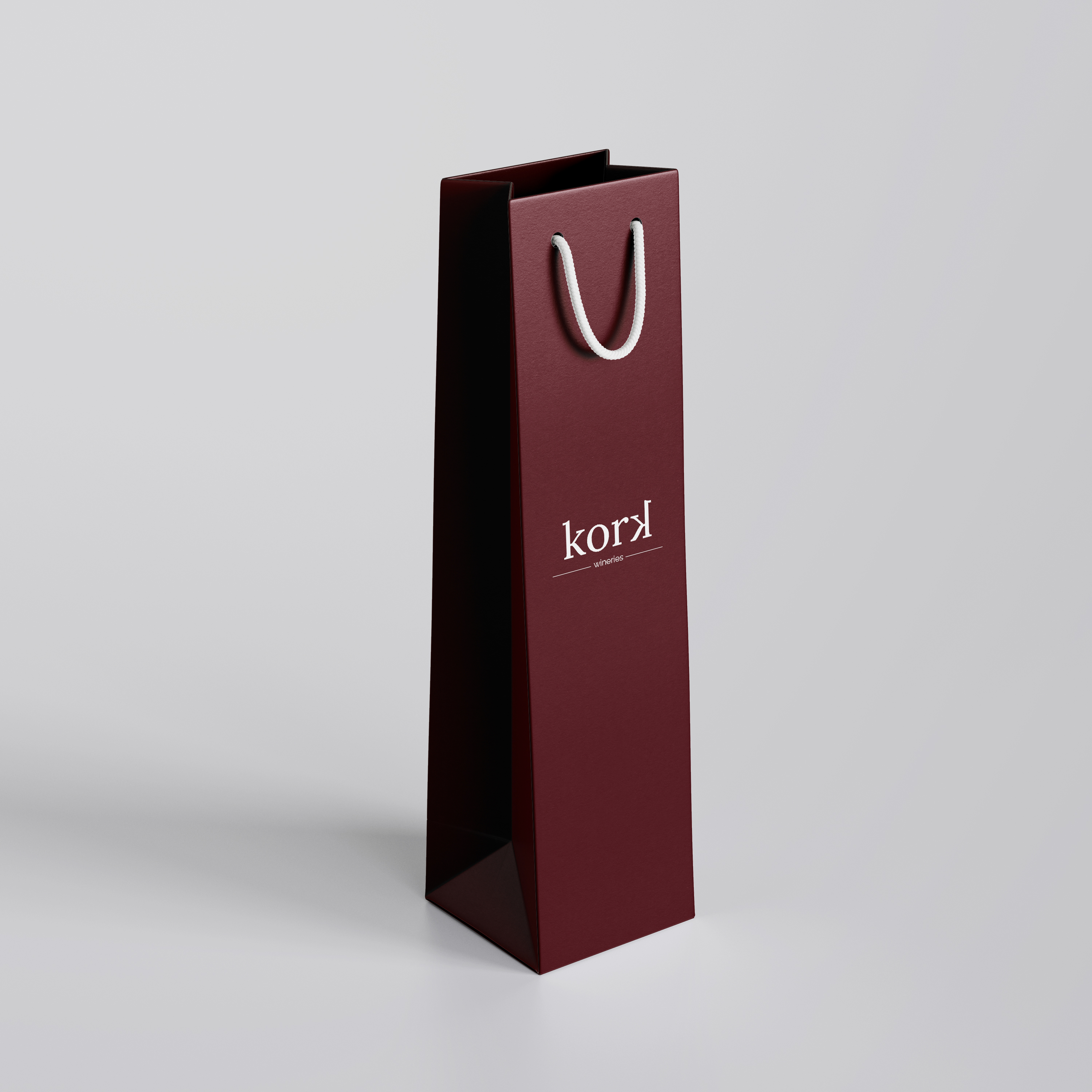
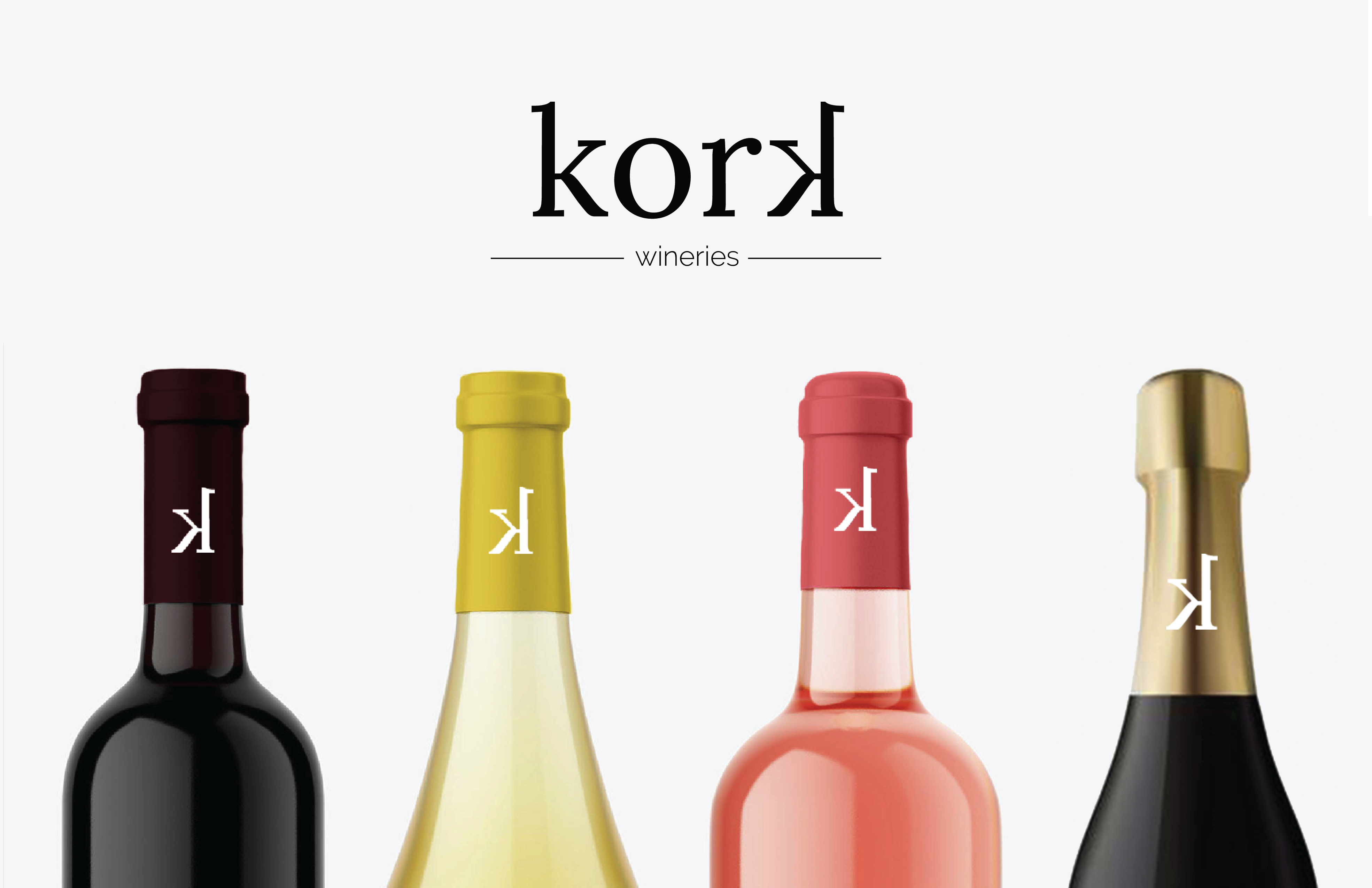
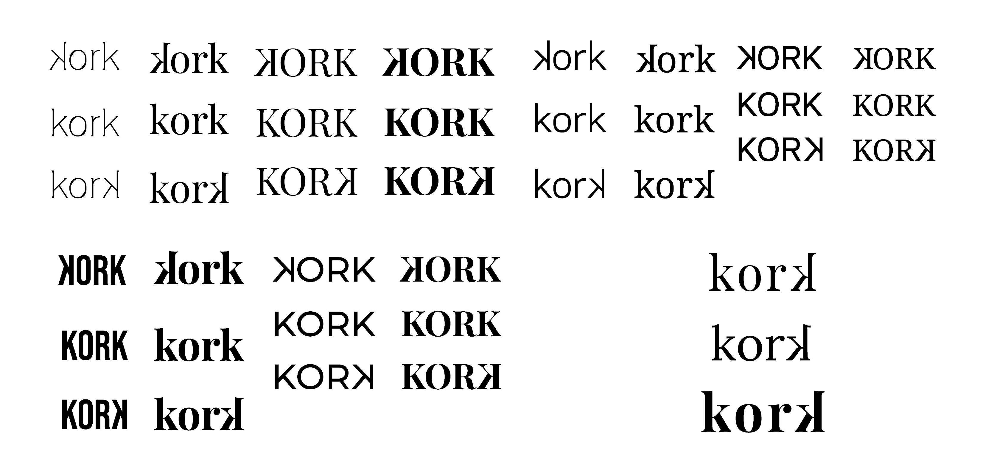
The name “Kork” is a playful twist on the word cork—simple, short, and easy to say. It perfectly embodies the brand's essence: approachable, sociable, and fun. The mirrored “K” adds a subtle visual quirk that echoes the youthful, bubbly personality of the brand, making it feel as dynamic as the people it’s meant to connect with.
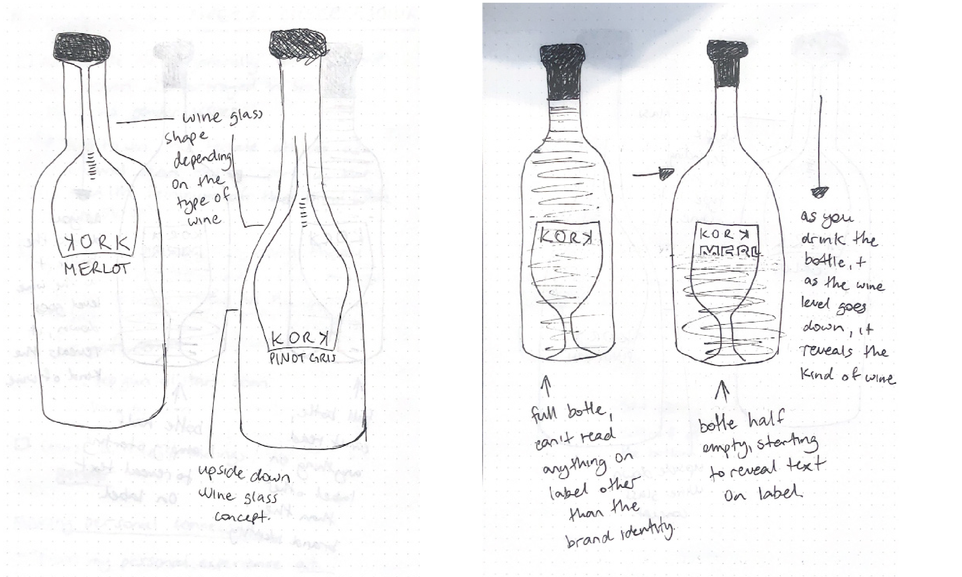
The brand identity and packaging system were designed to be bold, but approachable. Each wine label shape is unique and corresponds to the specific blend inside—drawing inspiration from the various shapes and sizes of wine glasses designed for different types of wine. This not only adds a layer of educational value for the consumer but also creates visual variation across SKUs while keeping the brand cohesive.
Kork was created with shelf impact and social media appeal in mind. The minimalist design, lack of clutter, and distinctive label shapes make it stand out among the hundreds of other bottles in a retail environment. The design captures attention from afar and invites consumers in with a modern and confident presence. It’s a brand that feels effortless, photogenic, and genuinely designed for today’s wine drinkers.
The result is a visual identity that celebrates curiosity, encourages exploration, and makes wine feel a little less intimidating—and a lot more fun.
THE PROCESS

THE OUTCOME